In what ways does your media product use, develop or challenge forms and conventions of real media products?
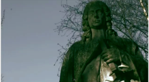
In The Executioner, we used, developed and challenged typical conventions of real media products. One of the things we followed was to use an establishing shot, to help set the scene and atmosphere for the film. We used the images of gravestones and statues, as well as the clip of the chapel to set our scene of the cemetery and to create an eerie atmosphere.

An example of a good film opening that sets the scene well is ‘Source Code.’ The credits are introduced from the start and the first thing we see is ‘Vendôme Pictures’, the production company, in front of a dark background. Then, the rest of the credits are shown as the film begins with serial shots of skyscrapers in Chicago and the title of the film appears in quite a subtle manner; the opening scene all accompanied by ominous and eerie music. This was an opening I really enjoyed as I think they used the establishing shots really well. The scenes of the city and skyscrapers imply fast-paced action and a sense of urgency for the rest of the film, which is a popular convention of action-thrillers.

The use of titles is one of the crucial components that construct an effective movie opening. It provides information as to who is involved in the movie, which is very important because audience usually create a point of view of the movie within those opening minutes. The titles can be used to lure the audience. For example, if it is made by 20th Century Fox, the audience are more likely to respond in a positive manner as it is a globally known company who are associated with many highly ranked movies. Also, the titles provide information such as the director and producer and the main actors. This is significant because well known directors and actors will always receive the audiences’ attention more easily. Due to their previous success, they will instantly excite the audience. One opening titles I really enjoyed was from the movie ‘Smokin’ Aces.’
It uses a stylised sequence for the titles, which makes the opening quite different from the opening of most films. It also works well because of the way colour is used. We see this opening has been edited to be ‘posterized.’ Instead of normal footage, it is a type of stylised editing which uses a dominant colour in each shot of this opening. It also keeps the opening a more upbeat atmosphere, and the music used in the opening to ‘Smokin’ Aces’ helps to do this.
We made the titles appear in the order they are expected to appear in real movies, to make our opening like a real media product. This is the typical order:
· Production companies
· Distribution companies
· Movie title
· Main actors
· Other (usually lesser known) actors
· Castings by
· Music by
· Production designer (Make up, costume, props etc)
· Edited by
· Director of photography
· Written by
· Director

These were the titles of The Executioner:
· Production company
· Distribution company
· Film by (director)
· Main actors
· Other actors
· Castings by
· Music by
· Edited by
· Director of photography
· Produced by
· Co-produced by
· Written by
· Director
The shots we used dissolve in and out to change the scene, which complimented our product and the music we used because it created a slow paced, tempo. The colours we used for the titles give the writing a cold, metallic effect, which parallels with the theme of death (knives are also cold and metal). When the names in the titles appeared, we made sure to use quite a large font, as it would be the only thing on the screen and the centre of attention. Instead of using a narrative opening or the titles on a blank screen followed by the shots, we had the titles come up in-between shots. I think this would be effective for our target audience because it provides all the information of the titles while maintaining the audiences’ attention.
No comments:
Post a Comment