Group 41
Friday, 30 March 2012
Final Media Product
Labels:
Alex Fluin,
Anil Berisha,
Shumon Ahmed,
Zubeir Bheekharry
Evaluation Question 7
Looking back at your preliminary task, what do you feel you have learnt in the progression from it to the full product?
In our preliminary exercise, we used a variety of camera angles and shots to to create an effective scene. We used low angle shots during the conversation scene in which the psychiatrist was portrayed to be looking down on the patient, which would show the patient's vulnerability. Additionally, we used a series of close ups such as the close up of the door handle and the patient to show their facial expressions which portrayed their feelings and thoughts.
We also used close ups in our actual product to show the facial expression and emotion on the face of the killer.
We used many shots similar to the prelim and some that we hadn't used in the prelim. One of the aims of the prelim was to use a match cut of two people talking. We took inspiration from this and used a match cut in The Executioner to show the killer throwing a towel over the body and we also see it from how the victim would see it.
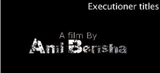
One of the most important things we learnt from the prelim was about how and where to place the titles. In the prelim, the titles came up on the screen over the moving images. But in our movie, we decided to use titles on a blank screen that would come in between shots. This was much more effective as it provided all the information while still maintaining the audiences' attention.

The 180° rule is a guideline in film making that states that two characters or objects in the same scene should always have the same left/right relationship to each other. This means (e.g. in a conversational scene) if the over the shoulder shot of one characters is shown from the right shoulder, the other character must be shown the same.
Overall, we learnt a lot from the prelim, which helped us to ensure that we were better prepared for The Executioner. In the prelim, we hadn't really tried anything out before filming. However, we made sure to try out all the shots in the classroom from the correct angles to make sure they would blend in well in the film. We also gained more knowledge of how to use sound and used foley sounds and music that suited our film opening.
Evaluation - Question 6.
What have you learnt about technologies from the process of constructing this product?
Final cut pro:
In order to produce the opening of our media product, we used various technologies such as 'final cut pro', 'soundtrack pro' and 'sony vegas'. We used final cut pro in order to put together the film as a whole, we used this program in combination with soundtrack pro which was used to match the sound to our opening to match foley sounds. for instance footsteps, dragging of body and writing. Also we used it in order to create an effective diegietic soundtrack which works well to capture our audience's attention and keep the on edge.Here is an example of a technique in which we used in final cut pro and how we did this:
Sony Vegas:
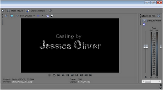
We used sony vegas as a separate programme in order to create the titles as we couldn't find the correct font in which we all agreed on. To make the title for my movie opening I used Sony Vegas Movie Studio. I wanted to use Livetype to make the titles but my group were behind schedule a bit so I decided to use a program that I was comfortable with and would be able to produce something. I thought about making the title a title on black screen. This would be placed at the beginning which would then be followed by the narrative.here I have chose the font in which i want to use, in this screen grab I am editing each titles in order for the titles to appear for 3 seconds each.
Here I have selected the time frame for each titles and testing it to ensure that they work correctly, after I will then import this into final cut pro and integrate each title in between scenes.
Soundtrack pro:
We used soundtrack pro in order to create an effective soundtrack for our media film opening. The ways in which we used soundtrack pro in order to combine all these technologies is that we used the final edit from final cut pro, exported this into a soundtrack pro, and then used the video to match sounds in the correct areas. we then combined all sounds to create one soundtrack which was the exported back to final cut pro and added to the overall film. We wanted to create an effective atmospheric sound in order to keep our audience on edge and to also attract our intended audience.
Labels:
Alex Fluin,
Anil Berisha,
Shumon Ahmed,
Zubeir Bheekharry
How does your media product represent particular social groups?
GoAnimate.com: Evaluation Q2 by aa43732
Like it? Create your own at GoAnimate.com. It's free and fun!
Like it? Create your own at GoAnimate.com. It's free and fun!
Evaluation Question 5
How did you attract/address your audience?
Evaluation - Question 7.
Looking back at your preliminary task, what do you feel you have learnt in the progression from it to the full product?
In our preliminary exercise our task we used various camera angles and shots In order to create an effective scene In which we used low angle shots during the conversation scene in which the patient was looked down on to portray vulnerability. Also a series of close ups were used for example the close up of the door handle and the patient to show there facial expressions which portrayed their feelings and thoughts.Preliminary close ups:
Final film close up:
Compared to our final film opening our grouped gained a better understanding of the use of camera shots and how to portray a characters status therefore before we went out to film we chose different camera angle in which we may use to portray a character a low status. For example we used a low angle shot of the victim being dragged. Other camera angles used were match cuts and close ups. The match cut was used to how the towel being thrown over the victims body. Also close ups were used to show the antagonists feelings and emotions.
Match cut
One particular problem we had with the prelim was getting the titles to fit in with shots before they changed which we found quite difficult, therefore in the final filming of our thriller opening we decided to use titles over a black screen in which allowed us to build tension and suspense therefore keeping the audience on edge.
In our preliminary exercise are task was to show our understanding of the 180 degree rule in which I think we did quite well for example the over the shoulder shots were kept to the character right shoulder and therefore not breaking the 180 degree rule. In our final media product we also used our understanding of the 180 degree rule therefore we also kept the camera on the left side of the chapel in which the dragging of the body was filmed.
180 degree rule used in preliminary
180 degree rule used in preliminary
180 degree used in final media product
In the preliminary of our product we did not use any particular sound apart from dialogue in which the conversation between the psychiatrist and patient was going on. However in our final media product we used soundtrack pro in order to create the sound for our final media product, we used Foley sounds in order to create a realistic scene. Also we used non-diegietic sound in order to create an atmospheric scene, which added to the suspense of our thriller. In addition the sound also worked well in time with our titles in which builds tension.
In addition we used a more complex range of editing techniques than we did in our preliminary such as the cross over fades and the opacity effects.
Evaluation Question 7
Looking back at your preliminary task, what do you feel you have learnt in the progression from it to the full product?
Evaluation question 2
How does your media product represent particular social groups?
Our film is mainly aimed at young people, and the representation of them can be very contrasting at times; they can be represented as a problem within society however they can be represented as the hope for society in terms of education. Below are a list of words often stereotypically associated with young people and teenagers in particular.
In our movie, we have used some of those stereotypes such as violence and villain. We have used close ups to portray the killer's feelings through his facial expression. We have used a dark hoodie to dress the killer- an item of clothing that is associated with young people- and leather gloves. The audience would instantly recognize this character and stereotypically view him as threatening and sinister. Finally, the actor who played the role of the murder victim is also a teenager, which is a contrasting representation of teenagers because he is seen as vulnerable but the other teen is a killer. Finally, we have stuck to the stereotypical portrayal of teens by having a dark skinned killer and a light skinned victim, although we have challenged one of the conventions of typical films and have a male victim instead of female.
Evaluation Question 1
In what ways does your media product use, develop or challenge forms and conventions of real media products?
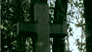
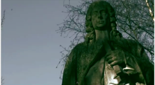
In The Executioner, we used, developed and challenged typical conventions of real media products. One of the things we followed was to use an establishing shot, to help set the scene and atmosphere for the film. We used the images of gravestones and statues, as well as the clip of the chapel to set our scene of the cemetery and to create an eerie atmosphere.
An example of a good film opening that sets the scene well is ‘Source Code.’ The credits are introduced from the start and the first thing we see is ‘Vendôme Pictures’, the production company, in front of a dark background. Then, the rest of the credits are shown as the film begins with serial shots of skyscrapers in Chicago and the title of the film appears in quite a subtle manner; the opening scene all accompanied by ominous and eerie music. This was an opening I really enjoyed as I think they used the establishing shots really well. The scenes of the city and skyscrapers imply fast-paced action and a sense of urgency for the rest of the film, which is a popular convention of action-thrillers.
Another typical form we followed was to use a tracking shot, which are often used in thrillers in order to reveal something that the storyline may revolve around. Here, we have used this shot to slowly reveal the dead body.
The use of titles is one of the crucial components that construct an effective movie opening. It provides information as to who is involved in the movie, which is very important because audience usually create a point of view of the movie within those opening minutes. The titles can be used to lure the audience. For example, if it is made by 20th Century Fox, the audience are more likely to respond in a positive manner as it is a globally known company who are associated with many highly ranked movies. Also, the titles provide information such as the director and producer and the main actors. This is significant because well known directors and actors will always receive the audiences’ attention more easily. Due to their previous success, they will instantly excite the audience. One opening titles I really enjoyed was from the movie ‘Smokin’ Aces.’
It uses a stylised sequence for the titles, which makes the opening quite different from the opening of most films. It also works well because of the way colour is used. We see this opening has been edited to be ‘posterized.’ Instead of normal footage, it is a type of stylised editing which uses a dominant colour in each shot of this opening. It also keeps the opening a more upbeat atmosphere, and the music used in the opening to ‘Smokin’ Aces’ helps to do this.
We made the titles appear in the order they are expected to appear in real movies, to make our opening like a real media product. This is the typical order:
· Production companies
· Distribution companies
· Movie title
· Main actors
· Other (usually lesser known) actors
· Castings by
· Music by
· Production designer (Make up, costume, props etc)
· Edited by
· Director of photography
· Written by
· Director
These were the titles of The Executioner:
· Production company
· Distribution company
· Film by (director)
· Main actors
· Other actors
· Castings by
· Music by
· Edited by
· Director of photography
· Produced by
· Co-produced by
· Written by
· Director
The shots we used dissolve in and out to change the scene, which complimented our product and the music we used because it created a slow paced, tempo. The colours we used for the titles give the writing a cold, metallic effect, which parallels with the theme of death (knives are also cold and metal). When the names in the titles appeared, we made sure to use quite a large font, as it would be the only thing on the screen and the centre of attention. Instead of using a narrative opening or the titles on a blank screen followed by the shots, we had the titles come up in-between shots. I think this would be effective for our target audience because it provides all the information of the titles while maintaining the audiences’ attention.
What kind of media institution might distribute your media product and why?
Thursday, 29 March 2012
Evaluation Question 3
What kind of media institution might distribute your media product and why?
Evaluation - Q1
In what ways does your media product use, develop or challenge forms and conventions of real media products?
Our media product uses a variety of different conventions to convey the idea of mystery and thrill. Film conventions are displayed in numerous different ways. For example, the genre romance uses the four micro features in a way that links to the film genre itself because it lets the audience understand what type of film it is and also allows them to feel a different experience to other genres. The conventions in action films are portrayed in a much faster phase camera movement, quicker cuts, and upbeat music in contrast to a romantic film. Title sequence conventions can be shown in various ways such as the film ‘knowing’ is a thriller that has a blank screen title sequence whereas, ‘Rambo I’ uses a narrative opening.
Narrative Blank screen
In our film opening we developed forms and conventions by using different types of elements that create the genre, thriller. We produced this through mise-en-scene, camera, editing, and sound. Also, we followed the conventions of titles by using the important ones that are viewed in an opening to a real media product. Also, we followed the order that is used in real media.
We used a lot of shots when showing the body being dragged because the cuts become faster phased which creates the tension that we want the audience to experience.
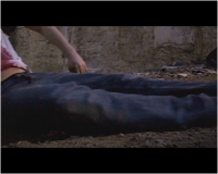
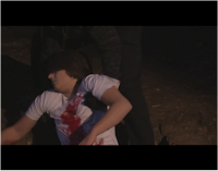
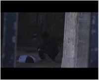
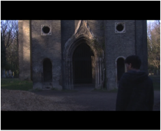
The music in out opening conveys the idea that this movie will be a thriller because of the slow-phased sounds and instruments. Moreover, we followed the conventions by using this type of music because it builds up the story and keeps the audience engaged with the story. Furthermore, the music is playing while the scenery is shown but once the first shot of where the killer in next to the victim the instruments start playing which emphasises the part that have the suspense and tension.
Evaluation - Question 2.
How does your media product represent particular social groups?
Tuesday, 27 March 2012
Evaluation Question 2
How does your media product represent particular social groups?
Evaluation - Question 3.
What kind of media institution might distribute your media product and why?
Evaluation Question 5
How did you attract/address your audience?
Monday, 26 March 2012
Evaluation - Question 4.
Who would be the audience for your media product?
The audience for our media product may be linked to the following words/phrases which are accompanied with a thriller opening film. the audience emotions may also affect who is attracted to our media product.Here is a quick clip of who we think would be the audience for our media product, here i have created a video of what they thought captured there eye overall.
Labels:
Alex Fluin,
Anil Berisha,
Shumon Ahmed,
Zubeir Bheekharry
Evaluation - Question 5.
How did you attract/address your audience?
Evaluation - Question 1.
In what ways does your media product use, develop or challenge forms and conventions of real media products?
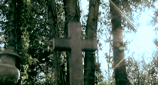
Psycho uses various zooms in the opening of their film which ay create tension. our group decided to use a zoom at the beginning of the film which keep the audience engaged and n edge.
Tracking shots are commonly used in thriller as they are used to reveal something which may be the subject of the film. we have used a tracking shot in order to reveal the dead body. this is a media convention we used as it is very common in thriller and we wanted this to appear clearly within the opening of our media products.
psycho uses a classic opening which is based of the titles being presented on a black screen, the effects and transitions help to create a distinct idea of violence which is accompanied with a string of orchestra adding drama and suspense.
The main aim was to challenge the conventions of titles within a thriller. Originally we decided to use a string of titles before the narrative; although this did not work effectively therefore we integrated them in between scenes to add suspense and drama to our media product. The title font used was quite distorted, along with a sweep of light which appeared red, foreshadowing violence and death later to in the storyline.
Conventions of media products are usually used in order for the audience to immediately recognise the different kind of conventions within a particular genre. For example, the conventions of a thriller may be the different kinds of camera movement such a panning or tracking shots, sound, titles which are generally shown over a black screen. All the above conventions are all used in order to create what is thought of as a thriller, a film in which creates a sense of mystery, suspense and tension ending with a cliff hanger in which makes the audience want more. In the opening of our media product, our group have thought carefully about the conventions of real media conventions such as, camera angles, sound, titles, mise en scene etc. Our group researched on different conventions other real media products used within a thriller. We then as a group carefully decided upon all the different aspects in order to catch our audience’s eye. We knew that the key of media product conventions was to create a strong visual interpretation of what our audience, instantly recognise when watching the opening of a real media product.
The conventions of ‘Psycho’ use many different forms of conventions, one of which is instantly is instantly recognised is sound in which a string of orchestra is used to create tension and drama. In addition, the sound also works well with the black and white cinematography of the film. The main title music is a very tense, dramatic piece which sets the tone of impending violence. Moreover, the sound also foreshadows the later events of the film which symbolises violence or even death. Psycho uses a classic opening which immediately hooks the audience through graphics, sound and editing. The titles are placed over a black screen which creates suspense. This type of title sequence was considered by our group however we thought this didn’t work well with the narrative of our opening media product. Instead we decided to place each title over a blank screen but in between scenes, this helped to add tension and drama to the opening of our media product which we decided was very effective. The use of camera angels within psycho allow the audience to create a sense of location. Also the use of zooms has been used effectively to add to the audiences fear and suspense of not knowing what’s going to happen next.
Our media group thought of different real media conventions in which work well with thrillers, this included the use of sound, camera angles, titles and mise en scene. Many common camera angels used within a thriller a tracking, panning and close ups. As a group we decided to challenge these conventions by using the tracking shot which appears as a panic shot as we reveal the body. Another shot used was a zoom in which we were told to avoid however we thought this would work really effectively at the begging as it opened up to the main plot of our film opening. We have also used many close ups to portray the characters feelings and emotions which appear sinister. In addition, we also get a sense of location which is located in a cemetery in which the antagonist hides the bodies of his victims in an old ruin chapel. This again adds to his character, which may be portrayed as quite sinister and mentally disturbed.
Friday, 23 March 2012
Evaluation Question 1
In what ways does your media product use, develop or challenge forms and conventions of real media products?
Similar in my movie opening, I have used an establishing shot as well. In my movie opening it is a shot of an ancient chapel. This symbolises death which is good and what we wanted as our movie is sub-genre to crime. Also using the transition of dissolving out, it creates a gloomy and creepy atmosphere.
Buried by Rodrigo Cortes has always captivated me. This is because it is very visual and the colour is bright. It grabs my attention. Also the title sequence is a stylised sequence. I like title sequence that are stylised as it gives the opening more ambiance. It makes the movie have a more exciting atmosphere and therefore keeps the audience interested. Sometimes titles that are squashed altogether at the beginning over a black screen. These are really bland and boring. Personally I would probably lose interest in a movie if it was like that. An example of this is the famous Psycho. Its’ titles are all at the beginning over a black screen.
To make my movie opening more like a real media product, I have made the titles appear in the order they normally appear in actual movies. This is what is most like to come up in order in real movies:
My media product used, developed and challenged forms and conventions of real media product. For instance we used title sequence and various camera shots.
Often, films would open with an establishing shot. This is effective as it straight away set the scene for the audience and also sets the atmosphere for the movie. For action thrillers, having an establishing of the city would be ideal. This can create a sense of urgency and alerts the audience know that the following will be action packed and fast paced. An example of this is Enemy of the state we see an establishing shot of the city of Washington DC.
Titles are also conventions of film opening. Title sequence is important as it tells us the people involved in this movie. It gives the audience a rough insight of how good the movie will be. By this I mean if by time producers and directors worked on this movie or which famous actors/actress stars in it. Depending on what genre the movie is, titles will look different. Some can be in white over a blank screen, same can be written in a special font with animation. Below is a good example:
Buried by Rodrigo Cortes has always captivated me. This is because it is very visual and the colour is bright. It grabs my attention. Also the title sequence is a stylised sequence. I like title sequence that are stylised as it gives the opening more ambiance. It makes the movie have a more exciting atmosphere and therefore keeps the audience interested. Sometimes titles that are squashed altogether at the beginning over a black screen. These are really bland and boring. Personally I would probably lose interest in a movie if it was like that. An example of this is the famous Psycho. Its’ titles are all at the beginning over a black screen.
Although I don’t think this is an effective method for title sequence, it works well with the non-digetic sound in the background. It works well to create tension and set a live atmosphere.
This particular title sequence is very simple and straight forward. When we planned what our title should be, at first we thought about making a title over black screen sequence, but as i’ve said, that is really bland. So we thought of mixing it up. We thought about having a narrative opening sequence with titles over a black screen in between. The titles however would be in a different font which looked creepy.
To make my movie opening more like a real media product, I have made the titles appear in the order they normally appear in actual movies. This is what is most like to come up in order in real movies:
- Production companies
- Distribution companies
- Directed by
- Movie title
- Actors
- Featuring actors
- Castings by
- Music by
- Production designer (make up, costume...etc)
- Edited by
- Director of photography
- Written by
- Directed by
The Executioner’s titles went as followed:
- Production company
- Distribution company
- Directed by
- Movie title
- Actors (main ones)
- Other actors (smaller part)
- Castings by
- Music by
- Edited by
- Director of photography
- Produced by
- Co-produced by
- Written by
- Directed by
Our shots dissolves in and out to change scene, we used this to create a slow paced tempo. Also being in the sub-genre of crime and mystery it suited more. It flowed more with the story line. If our movie was an action thriller then having quick transitions with flashes would be better. Since the opening is set in a chapel, we thought about making the titles white, grey and black with also a shiny beam going from right to left. This was created using Sony Vegas home Studio.
The colour grey gives the title a metallic effect which is cold. This works well with the idea of crime and death. The letters are not all filled in which makes it look dirty. Another good thing we I considered when making the title. The font size is quite big, this was important as it would be the only thing on the screen. Also I placed it in the middle because I wanted it to grabbed the audience’s attention and keep them interested in the movie.
Subscribe to:
Comments (Atom)


